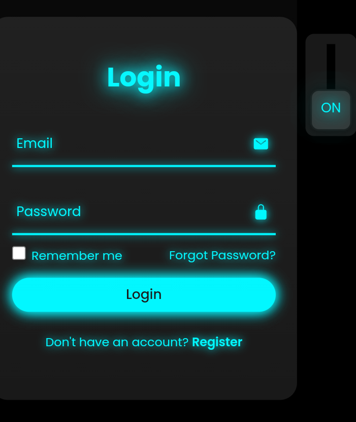
neon log in form of html with css
Please connect the the file of the css with proper way .
Html Syntex
<html lang="en">
<head>
<meta charset="UTF-8">
<meta http-equiv="X-UA-Compatible" content="IE=edge">
<meta name="viewport" content="width=device-width, initial-scale=1.0">
<title>Login Form Animation CSS | Codehal</title>
<link rel="stylesheet" href="style.css">
</head>
<body>
<div class="login-light"></div>
<div class="login-box">
<form action="#">
<input type="checkbox" class="input-check" id="input-check">
<label for="input-check" class="toggle">
<span class="text off">off</span>
<span class="text on">on</span>
</label>
<div class="light"></div>
<h2>Login</h2>
<div class="input-box">
<span class="icon">
<ion-icon name="mail"></ion-icon>
</span>
<input type="email" required>
<label>Email</label>
<div class="input-line"></div>
</div>
<div class="input-box">
<span class="icon">
<ion-icon name="lock-closed"></ion-icon>
</span>
<input type="password" required>
<label>Password</label>
<div class="input-line"></div>
</div>
<div class="remember-forgot">
<label><input type="checkbox"> Remember me</label>
<a href="#">Forgot Password?</a>
</div>
<button type="submit">Login</button>
<div class="register-link">
<p>Don't have an account? <a href="#">Register</a></p>
</div>
</form>
</div>
<script type="module" src="https://unpkg.com/ionicons@5.5.2/dist/ionicons/ionicons.esm.js"></script>
<script nomodule src="https://unpkg.com/ionicons@5.5.2/dist/ionicons/ionicons.js"></script>
</body>
</html>
Css Syntex
@import url('https://fonts.googleapis.com/css2?family=Poppins:wght@300;400;500;600;700;800;900&display=swap');
* {
margin: 0;
padding: 0;
box-sizing: border-box;
font-family: 'Poppins', sans-serif;
}
body {
display: flex;
justify-content: center;
align-items: center;
min-height: 100vh;
background: #000;
overflow: hidden;
}
.login-box {
position: relative;
width: 400px;
height: 450px;
background: #191919;
border-radius: 20px;
display: flex;
justify-content: center;
align-items: center;
}
h2 {
font-size: 2em;
color: #fff;
text-align: center;
transition: .5s ease;
}
.input-check:checked~h2 {
color: #00f7ff;
text-shadow:
0 0 15px #00f7ff,
0 0 30px #00f7ff;
}
.input-box {
position: relative;
width: 310px;
margin: 30px 0;
}
.input-box .input-line {
position: absolute;
bottom: -2px;
left: 0;
width: 100%;
height: 2.5px;
background: #fff;
transition: .5s ease;
}
.input-check:checked~.input-box .input-line {
background: #00f7ff;
box-shadow: 0 0 10px #00f7ff;
}
.input-box label {
position: absolute;
top: 50%;
left: 5px;
transform: translateY(-50%);
font-size: 1em;
color: #fff;
pointer-events: none;
transition: .5s ease;
}
.input-box input:focus~label,
.input-box input:valid~label {
top: -5px;
}
.input-check:checked~.input-box label {
color: #00f7ff;
text-shadow: 0 0 10px #00f7ff;
}
.input-box input {
width: 100%;
height: 50px;
background: transparent;
border: none;
outline: none;
font-size: 1em;
color: #fff;
padding: 0 35px 0 5px;
transition: .5s ease;
}
.input-check:checked~.input-box input {
color: #00f7ff;
text-shadow: 0 0 5px #00f7ff;
}
.input-box .icon {
position: absolute;
right: 8px;
color: #fff;
font-size: 1.2em;
line-height: 57px;
transition: .5s ease;
}
.input-check:checked~.input-box .icon {
color: #00f7ff;
filter: drop-shadow(0 0 5px #00f7ff);
}
.remember-forgot {
color: #fff;
font-size: .9em;
margin: -15px 0 15px;
display: flex;
justify-content: space-between;
transition: .5s ease;
}
.input-check:checked~.remember-forgot {
color: #00f7ff;
text-shadow: 0 0 10px #00f7ff;
}
.remember-forgot label input {
accent-color: #fff;
margin-right: 3px;
transition: .5s ease;
}
.input-check:checked~.remember-forgot label input {
accent-color: #00f7ff;
}
.remember-forgot a {
color: #fff;
text-decoration: none;
transition: color .5s ease;
}
.remember-forgot a:hover {
text-decoration: underline;
}
.input-check:checked~.remember-forgot a {
color: #00f7ff;
}
button {
width: 100%;
height: 40px;
background: #fff;
border: none;
outline: none;
border-radius: 40px;
cursor: pointer;
font-size: 1em;
color: #191919;
font-weight: 500;
transition: .5s ease;
}
.input-check:checked~button {
background: #00f7ff;
box-shadow: 0 0 15px #00f7ff, 0 0 15px #00f7ff;
}
.register-link {
color: #fff;
font-size: .9em;
text-align: center;
margin: 25px 0 10px;
transition: .5s ease;
}
.input-check:checked~.register-link {
color: #00f7ff;
text-shadow: 0 0 10px #00f7ff;
}
.register-link p a {
color: #fff;
text-decoration: none;
font-weight: 600;
transition: color .5s ease;
}
.register-link p a:hover {
text-decoration: underline;
}
.input-check:checked~.register-link p a {
color: #00f7ff;
}
.login-light {
position: absolute;
top: 0;
left: 50%;
transform: translateX(-50%);
width: 500px;
height: 10px;
background: #00f7ff;
border-radius: 20px;
}
.light {
position: absolute;
top: -200%;
left: 0;
width: 100%;
height: 950px;
background: linear-gradient(to bottom, rgba(255, 255, 255, .1) -50%, rgba(255, 255, 255, 0) 90%);
clip-path: rectangle (20% 0, 80% 0, 100% 100%, 0 100%);
pointer-events: none;
transition: .5s ease;
}
.input-check:checked~.light {
top: -90%;
}
.toggle {
position: absolute;
top: 20px;
right: -70px;
width: 60px;
height: 120px;
background: #191919;
border-radius: 10px;
}
.toggle::before {
content: '';
position: absolute;
top: 50%;
left: 50%;
transform: translate(-50%, -50%);
width: 10px;
height: 80%;
background: #000;
}
.toggle::after {
content: '';
position: absolute;
top: 5px;
left: 50%;
transform: translateX(-50%);
width: 45px;
height: 45px;
background: #333;
border: 2px solid #191919;
border-radius: 10px;
cursor: pointer;
box-shadow: 0 0 10px rgba(0, 0, 0, .5);
transition: .5s ease;
}
.input-check:checked~.toggle::after {
top: 65px;
}
.input-check {
position: absolute;
right: -70px;
z-index: 1;
opacity: 0;
}
.toggle .text {
position: absolute;
top: 17px;
left: 50%;
transform: translateX(-50%);
color: #fff;
font-size: 1em;
z-index: 1;
text-transform: uppercase;
pointer-events: none;
transition: .5s ease;
}
.toggle .text.off {
opacity: 1;
}
.input-check:checked~.toggle .text.off {
top: 76px;
opacity: 0;
}
.toggle .text.on {
opacity: 0;
}
.input-check:checked~.toggle .text.on {
top: 76px;
opacity: 1;
color: #00f7ff;
text-shadow:
0 0 15px #00f7ff,
0 0 30px #00f7ff,
0 0 45px #00f7ff,
0 0 60px #00f7ff;
}
Out put

Comments