Creating a Floating Label in HTML and CSS

Creating a Floating Label in HTML and CSS: A Step-by-Step Guide
Floating labels are an excellent way to enhance user experience in forms by making them clean, modern, and intuitive. This design pattern keeps the label visible when the user interacts with the input field, ensuring clarity and usability. In this article, we will learn how to create a floating label effect using simple HTML and CSS.
---
Why Use Floating Labels?
Floating labels improve the usability and aesthetics of forms. Here are the key advantages:
Space Efficiency:
Labels don’t occupy additional space and integrate seamlessly with input fields.
Improved Clarity:
Users can always see which field they are filling out.
Modern Design:
Floating labels are widely used in modern web applications, giving your website a professional look.
---
Building a Floating Label with HTML and CSS
Here’s how to create a floating label from scratch.
1. Basic HTML Structure
Start by creating the form structure with a label and an input field:
<!DOCTYPE html>
<html lang="en">
<head>
<meta charset="UTF-8">
<meta name="viewport" content="width=device-width, initial-scale=1.0">
<title>Floating Label Example</title>
<link rel="stylesheet" href="styles.css">
</head>
<body>
<div class="form-container">
<div class="form-group">
<input type="text" id="name" required>
<label for="name">Your Name</label>
</div>
</div>
</body>
</html>(code-box)
Here, the label is positioned next to the input field, and we’ll style it to achieve the floating effect.
---
2. CSS Styling
Now, let’s write the CSS to make the label float when the user interacts with the input field.
/* Reset basic styles */
body {
font-family: Arial, sans-serif;
margin: 0;
padding: 0;
display: flex;
justify-content: center;
align-items: center;
height: 100vh;
background-color: #f4f4f9;
}
.form-container {
width: 300px;
}
.form-group {
position: relative;
margin: 20px 0;
}
input {
width: 100%;
padding: 10px 10px 10px 5px;
font-size: 16px;
border: 1px solid #ccc;
border-radius: 4px;
outline: none;
background: none;
}
input:focus {
border-color: #6200ea;
}
label {
position: absolute;
top: 10px;
left: 5px;
font-size: 16px;
color: #aaa;
pointer-events: none;
transition: 0.3s ease all;
}
input:focus + label,
input:not(:placeholder-shown) + label {
top: -10px;
left: 5px;
font-size: 12px;
color: #6200ea;
}(Code-box)
---
3. Explanation of the CSS
Positioning: The label is absolutely positioned relative to its parent .form-group, ensuring it can move independently of the input field.
Transition: The transition property provides a smooth animation when the label moves to the floating state.
Focus & Content Detection: The :focus and :not(:placeholder-shown) pseudo-classes handle the label's position.
---
4. Adding Placeholder Text
For a better user experience, you can add placeholder text to the input field:
<input type="text" id="name" placeholder=" " required>(code-box)
The empty placeholder ensures that the label works seamlessly without clashing with the default placeholder behavior.
---
5. Responsive Adjustments
Make the floating label responsive by tweaking font sizes or padding for smaller screens:
@media (max-width: 480px) {
input {
font-size: 14px;
padding: 8px 8px 8px 4px;
}
label {
font-size: 14px;
}
}(Code-box)
---
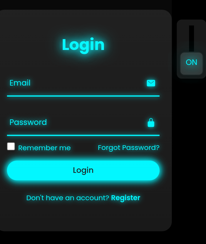
Final Output
Once you implement the HTML and CSS, you’ll have a sleek floating label input field that looks great on all devices.
---
Conclusion
Floating labels are a great way to modernize your forms and improve usability. With minimal HTML and CSS, you can implement this feature and impress your users with a professional design.
Try it on your next project and see how much of a difference it makes!
Feel free to experiment with colors, fonts, and animations to match your website’s theme.
Comments